QR codes do not have to be plain black squares, but every visual change creates a trade-off between branding and scan reliability. The safest design is simple, high-contrast and surrounded by clear space. When a campaign needs custom colors, frames or logos, the design should be tested on actual devices and final materials. This guide explains the design decisions that have the largest effect on scanning and how to create a branded result without sacrificing usability.
Start with strong contrast
Dark modules on a light background provide the strongest baseline. If you use brand colors, compare their relative brightness rather than relying only on hue. Two different colors can still be too similar in brightness for a camera to separate quickly.
Avoid extremely pale foreground colors and backgrounds with strong texture. If the QR code sits over a photograph, place it on a plain light panel that preserves clear edges.
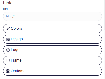
Screenshot evidence: customization controls
The design recommendations in this article are tied to the real customization controls available in the generator. The screenshot shows the color and design panels that should be adjusted conservatively and tested after each change.
Use strong foreground and background contrast before adding decoration.
Keep the logo controlled and away from finder patterns.
Use frames as context, not as decoration that crowds the code.
Check final output after every meaningful setting change.
Protect the quiet zone
The quiet zone is the blank space around the QR pattern. It helps the scanner distinguish the code from surrounding graphics. Text, borders, icons and decorative shapes should not intrude into this area.
Designers sometimes crop the blank margin because it appears unnecessary. That can reduce scan speed or make the code fail in busy layouts. Treat the quiet zone as functional space, not wasted space.
Choose a sensible physical size
A code that works at 300 pixels on screen may fail when printed as a tiny square. Module size, data density and scanning distance all influence the minimum practical size. Longer content usually creates a denser pattern that needs more physical room.
Always print a one-to-one proof. For posters or signage, test from the distance a user will actually stand. If users need to move unusually close, increase the code size.
Use custom shapes cautiously
Some generators allow rounded modules, dots and custom finder-pattern styles. Moderate styling can work, but extreme changes may make the pattern less recognizable to older or lower-quality cameras.
Apply one design change at a time and scan after each change. This makes it easier to identify which customization caused a problem.
Add logos without covering critical areas
Keep logos near the center and away from the three large finder patterns. Start with a small mark and use a clean background around it. A logo should support branding without becoming the dominant element.
Higher error-correction settings can add tolerance, but they also increase data density. Test the final balance at the smallest intended size.
Consider print materials and lighting
Glossy lamination can create reflections that hide parts of the pattern. Curved packaging can distort the code. Fabric can stretch, and low-quality printing can cause small modules to bleed together. These are production issues, not generator issues.
Test the exact substrate whenever possible. A proof on office paper is not enough if the final product will be a reflective pouch or curved bottle.
Use a helpful frame and call to action
A frame can make the code easier to notice and can provide space for a short instruction such as “Scan for menu” or “Open setup guide”. Keep the frame outside the quiet zone and avoid creating visual clutter around the pattern.
The call to action should describe the result of scanning. Clear context improves user confidence and can increase engagement more effectively than decorative complexity.
Design review checklist
Check contrast, quiet zone, physical size, logo placement, module clarity, final material and scan distance. Test several phones and re-test after the artwork is exported for production.
If scanning feels slow or inconsistent, simplify the design before increasing complexity elsewhere. Reliability should be treated as a core part of the visual design.
Create and test your QR code
Use the generator, then apply the practical checks from this guide before you publish or print.
Open QR Generator